マーケティングのインクリメンタリティを紐解く①
最近、マーケティングの世界で「インクリメンタリティ」という言葉を耳にする機会が増えました。
施策の効果をより正確に把握したい、というニーズが高まる中で、この考え方が注目されているようです。
その割に、それをどう測るべきか?について、原則論が置き去りになったまま、「あの指標を使うべき」とか、「アンケートで何となく」とか、理論的根拠の無い発想と議論が展開されることが少なくないように思います。
自分自身の理解度向上のためにも少しまとめておきたい。

1. なぜ今「インクリメンタリティ」なのか?
従来のマーケティング効果測定、例えばアトリビューション分析では、「どの広告がコンバージョンに貢献したか?」といった関連性(相関関係)を見るのが一般的でした。
しかし、「その広告が本当にコンバージョンを引き起こしたのか?」という問いに答えるのは、実は簡単ではありません。
もしかしたら、広告がなくてもコンバージョンしていたかもしれない。
あるいは、他の要因が影響していたかもしれない。
こうした疑問に応え、「施策が純粋にどれだけ成果を上乗せしたのか?」、つまり**原因と結果の関係(因果関係)**を明らかにしようとするのが、インクリメンタルマーケティングの基本的な考え方です。
2. その考え方、実は「因果推論」
この「原因と結果の関係」を突き詰めようとするアプローチ、これは近年データサイエンス分野で非常に注目されている「因果推論(Causal Inference)」の考え方そのものです。
因果推論は、「もし〇〇がなかったら、どうなっていただろうか?(反事実)」という問いを立て、統計的な手法や実験デザインを用いて、ある介入(マーケティング施策など)が結果(売上など)に与えた真の影響を推定しようとします。
インクリメンタルマーケティングは、この因果推論のフレームワークをマーケティング領域に応用したもの、と捉えるだけで事足りそうです。(どっかから怒られそう)
単に「関連がありそう」というレベルを超えて、「施策Aが原因で、これだけの成果Yが増えた」ということを、より確からしく言えるようにするための方法論、というわけです。
3. 主なアプローチ
では、この「インクリメンタルな効果」を具体的にどうやって測定するのか?
大きく分けて、2つのアプローチがあります。
- 実験的アプローチ(RCT:ランダム化比較試験)
これは、いわゆる「A/Bテスト」に代表される方法で、有名ですね。
対象者をランダムに2つのグループ(施策を行うグループと行わないグループ)に分け、その結果を比較することで、施策の純粋な効果を測定します。
ランダム化によって、他の要因の影響を(理論上は)排除できるため、因果関係を特定する上では最も信頼性の高い「ゴールドスタンダード」とされています。
- 準実験・統計解析的アプローチ
RCTが最も妥当な手法ですが、常に厳密に実現ができるとは限りません。
コストや倫理的な問題、技術的・ビジネス的な制約がある場合も多いです。
そのような場合に用いられるのが、このアプローチです。
準実験
ランダム化はできないものの、何らかの自然な状況や制度変更などを利用して、実験に近い状況を作り出して分析します。
例えば、特定の地域だけで施策を実施し、他の地域と比較する「ジオリフト(Geo-Experiment / Geo-Lift)」などがこれにあたります。
統計解析
過去のデータ(観察データ)を用いて、統計モデルによって施策の効果を推定しようとします。
マーケティングミックスモデリング(MMM)を因果推論の視点で活用したり、傾向スコアマッチング(PSM)や差分の差分法(DiD)といった計量経済学的な手法を用いたりします。
これらの手法は、実験ができない状況でも示唆を与えてくれますが、「分析の前提条件(仮定)が満たされているか」を慎重に検討する必要があります。これらのアプローチは万能ではなく、それぞれにメリット・デメリット、適用できる場面があります。
目的や状況に応じて適切な方法を選ぶことが重要になります。
まとめ
今回は、マーケティングの「インクリメンタリティ」が注目される背景と、その核心にある「因果推論」の考え方、そして主な測定アプローチの概要について見てきました。
次回は、これらのアプローチを実際に導入・活用していく上で、どのような課題があり、どう乗り越えていけばよいのか、より実践的な側面に焦点を当てて整理してみようかなと思います。
昨今はMMMやUpliftModeling など、この領域に関係する技術革新がとても進んでいるので、マーケティングの実践領域でもしっかり活用していきたいですね。
Numpyroでベイズ統計モデリング~GLMM~
RとStanで始めるベイズ統計モデリングによるデータ分析入門のNumpyro実装第7回。
")
今回は一般可線形混合モデル(GLMM)にベイズ推定を利用した、いわゆる階層ベイズモデルです。
準備
import jax.numpy as jnp
import numpy as np
import jax.random as random
import pandas as pd
import matplotlib.pyplot as plt
import seaborn as sns
sns.set(style='darkgrid',palette='bright')

!pip install numpyro
import numpyro
import numpyro.distributions as dist
from numpyro.infer import MCMC, NUTS
numpyro.set_host_device_count(4)

import arviz as az
df = pd.read_csv("/4-1-1-fish-num-2.csv")

今回のデータは過去ポアソン回帰で利用したデータと似ていますが、各レコードに一意のid列があります。
それぞれのデータの背景として、計測されていないものが理由で目的変数が変化することを想定したモデルにする必要があるということです。
color_dict = {"cloudy":"b","sunny":"r"}

g = sns.relplot(data=df,x="temperature",y="fish_num",hue="weather",palette=color_dict)
g.fig.set_figheight(6)
g.fig.set_figwidth(10)

単純に可視化しても、通常のポアソン分布よりも分散が大きそうであることがわかります。
確認
これを、過去と同様に単純なポアソン回帰にあてはめて推定してみます。
def model_1(
    N,
    C,
    X,
    fish_num,

):
  beta = numpyro.sample("beta",dist.Normal(0,100),sample_shape=(C,))

  with numpyro.plate("N",N):
    lambda_ = jnp.exp(jnp.dot(X,beta))
    numpyro.sample("fish_num",dist.Poisson(lambda_),obs = fish_num)
※モデル以外のサンプリング・可視化コードは過去同様なので省略

99%予測区間よりも外側に多くのデータが位置し、モデルの精度があまり高くないことがわかります。
モデル
ここで利用したモデルは以下のような以下のような単純なモデルとなっています。

※ここで、 $x_1$ は'weather'のダミー変数、 $x_2$ は'temperature' です。
このモデルを改良し、線形予測子にランダム効果を加えた以下のようなモデルにとします。

前述のモデルはすべての事象に共通した効果量であるため固定効果と呼ばれ、$r_i$ のような何らかの確率分布に従いランダムに変化する係数であるため、ランダム効果と呼ばれます。
このような固定効果とランダム効果を組み合わせたモデルを混合モデルと呼び、これまでの一般化線形モデルにランダム効果を加えたモデルを一般化線形混合モデル(GLMM)と呼びます。
これもNumpyroで以下のとおり実装します。
def model_2(
    N,
    C,
    X,
    fish_num,

):
  beta = numpyro.sample("beta",dist.Normal(0,100),sample_shape=(C,))
  sigma_r = numpyro.sample("sigma_r",dist.HalfNormal(100))
  r = numpyro.sample("r",dist.Normal(0,sigma_r),sample_shape=(N,))

  with numpyro.plate("N",N):
    lambda_ = jnp.exp(jnp.dot(X,beta)+r)
    numpyro.sample("fish_num",dist.Poisson(lambda_),obs = fish_num)
X_1 = df_2[["Intercept","weather_sunny","temperature"]].values
data_dict_1 = {
    "N":X_1.shape[0],
    "C":X_1.shape[1],
    "X":X_1,
    "fish_num":df["fish_num"].values
}

kernel_2 = NUTS(model_2)
sample_kwargs_2 = dict(
    sampler=kernel_2,
    num_warmup=2000,
    num_samples=2000,
    num_chains=4,
    chain_method="parallel"
)
mcmc_2 = MCMC(**sample_kwargs_2)
mcmc_2.run(random.PRNGKey(0), **data_dict_1)
解釈
az.plot_trace(mcmc_2,compact=True,figsize=(14,8))
plt.show()
トレースプロットは以下のとおりできちんと収束していることがわかります。
'sigma_r' がランダム効果の分散で、それによって 'r' がサンプルごとに異なっていることがわかります。

az.summary(mcmc_2,var_names=["beta","sigma_r"])
各パラメータも書籍と同様になっており、無事サンプルごとのランダム効果を取り入れたGLMMが推定できました。

Numpyroでベイズ統計モデリング~ロジスティック回帰モデル~
RとStanで始めるベイズ統計モデリングによるデータ分析入門のNumpyro実装第6回。
今回はロジスティック回帰モデルをやっていきます。
準備
import jax.numpy as jnp
import numpy as np
import jax.random as random
import pandas as pd
import matplotlib.pyplot as plt
import seaborn as sns
sns.set(style='darkgrid',palette='bright')

import numpyro
import numpyro.distributions as dist
from numpyro.infer import MCMC, NUTS
numpyro.set_host_device_count(4)

import arviz as az

germination_dat = pd.read_csv("3-9-1-germination.csv")

color_dict = {"shade":"b","sunshine":"r"}

g = sns.relplot(data=germination_dat,x="nutrition",y="germination",hue="solar",palette=color_dict)
g.fig.set_figheight(6)
g.fig.set_figwidth(10)

上記のように、植木鉢の中の10個の種子から、何粒が発芽したかを示すデータとなっています。
変数として solar が含まれており、sunshine と shade で発芽率に差があるようなデータとなっています。
モデル
上記データを以下のようなモデルにします。

これは、リンク関数がロジスティック関数、確率分布に二項分布を利用した一般化線形モデルで、通称ロジスティック回帰モデルと呼ばれます。
※ロジスティック回帰モデルというと、 1 か 0 の予測をするモデルであるという認識もありますが、
その場合、二項分布ではなくベルヌーイ分布(つまり1回の試行のうちの成功確率)を利用するモデルです。(二項分布の n = 1 と同義)
二項分布を利用することで、複数の試行回数における成功確率をモデル化できます。
#ダミー変数化
germination_dat_2 = pd.get_dummies(germination_dat).drop("solar_shade",axis=1)
germination_dat_2["Intercept"] = 1


#モデル

def model(
    N,
    C,
    X,
    size,
    germination,

):
  beta = numpyro.sample("beta",dist.Normal(0,100),sample_shape=(C,))

  with numpyro.plate("N",N):
    prob = jnp.dot(X,beta)
    numpyro.sample("germination",dist.BinomialLogits(logits=prob,total_count=size),obs = germination)


# 推論
X = germination_dat_2[["Intercept","solar_sunshine","nutrition"]].values
data_dict = {
    "N":X.shape[0],
    "C":X.shape[1],
    "X":X,
    "size":10,
    "germination":germination_dat_2["germination"].values
}

kernel = NUTS(model)
sample_kwargs = dict(
    sampler=kernel,
    num_warmup=2000,
    num_samples=2000,
    num_chains=4,
    chain_method="parallel"
)
mcmc = MCMC(**sample_kwargs)
mcmc.run(random.PRNGKey(0), **data_dict)
解釈
結果は無事、書籍と同一になりました。 トレースプロットも問題ないようです。
az.summary(mcmc)

az.plot_trace(mcmc,compact=False,figsize=(14,8))


ロジスティック回帰モデルの回帰係数の解釈は「対数オッズ比」であるため注意が必要です。
事後予測分布
このモデルの事後予測分布がどのようになってるかみてみたいと思います。
mcmc_samples=mcmc.get_samples()
predictive = numpyro.infer.Predictive(model, mcmc_samples)

pred_dict = {
    "N":X.shape[0],
    "C":X.shape[1],
    "X":X,
    "size":10,
    "germination":None
}

ppc_samples = predictive(random.PRNGKey(0),**pred_dict)
idata_ppc = az.from_numpyro(mcmc, posterior_predictive=ppc_samples)
germination_pred =  idata_ppc.posterior_predictive['germination']


#予測分布用データ
shade_index = germination_dat_2[germination_dat_2["solar_sunshine"]==0].index
sunshine_index = germination_dat_2[germination_dat_2["solar_sunshine"]==1].index

shade_nutrition = germination_dat_2.iloc[shade_index,:]["nutrition"]
sunshine_nutrition = germination_dat_2.iloc[sunshine_index,:]["nutrition"]

shade_germination_pred = ppc_samples["germination"][:,list(shade_index)]
sunshine_germination_pred = ppc_samples["germination"][:,list(sunshine_index)]

#サンプリング
ax = az.plot_hdi(shade_nutrition, shade_germination_pred, hdi_prob=0.99, plot_kwargs={"ls": "--"},smooth=False,color="b",figsize=(10,6))
az.plot_hdi(sunshine_nutrition, sunshine_germination_pred, hdi_prob=0.99, plot_kwargs={"ls": "--"},smooth=False,color="r")
sns.scatterplot(data=germination_dat, x="nutrition",y="germination",hue="solar",palette=color_dict)
plt.show()

すべてのデータが99%予測分布内に収まっており、
nutrition が高くなるほど発芽率が高く、sunshine のときに発芽率が高いことが理解できました。
おわりに
今回までシンプルな一般化線形モデルをつくってきました。
次回からはGLMM、ランダム効果を仮定したモデル、いわゆる階層ベイズモデルです。
だいたい1年経ったし、電子ペーパー「QUADERNO」のレビューをしてみる
富士通の電子ペーパー「QUADERNO」を購入してだいたい1年経ったので、使ってきた感想総括していきます。

なお、iPadや他社電子ペーパーを一度も触ったことが無いので、完全な主観的絶対評価であることを予め明言しておきます。
QUADERNOとは
QUADERNOは富士通製の電子ペーパーです。 電子書籍などに利用されているE Ink ディスプレイに書き込むので、目が疲れることなくノートを書いていけるのが電子ペーパーのポイントです。
自分が購入したのは「QUADERNO A5 (Gen. 2)」。A5版の電子ノートです。
富士通製にしたのは、なんとなくバッテリー関係とかサポート関係が安心そうだったから。
謳い文句だけ見たら boox もすごく魅力的だったので悩みましたが、こちらに。
使用感
自分は主に論文や技術リファレンス読む&統計学関連の勉強で利用しています。
書き心地は、画面のザラザラがとても心地よい感じで、気に障る遅延もなく、快適に文字を書いていけます。
iPadとかだと画面ツルツルなのでこうはいかないのかなーとか思ったり。
またスタイラスペンが充電不要で便利。
付属品ではなく以下LAMYのコラボペンを使っていますが、軸が太いのでいくら書いてても疲れない点もポイントです。
付属ペンは後部が消しゴム機能になってるっぽいのですが、LAMYは側面ボタンを押しながら消す感じ。
後部(キャップ頭)消しゴムがあったら満点だった。
なお、芯は恐ろしく早く削れていきます・・・。筆圧が高いのか・・・?
重さ
公式では 質量:約261g とあります。
私は純正カバーも合わせて使ってますが、かなり軽い。
電子書籍と合わせると、ひたすら重い専門書とノート、鉛筆類から開放されます。
ノート
白紙や方眼など様々なタイプが指定可能。 使ってませんがスケジュールとかもあるみたい。
PDFを取り込んで、PDF上に直接書き込むことができるので、論文とか資料の読解には重宝します。

自分はA5版なので、A4版資料がやや縮小され見にくい場合がありますが、慣れればほとんど気にならない範囲。
A5版でも比較的大きいので、持ち運びするならA5版がおすすめです。
持ち運びせず、A4資料の利用が主ならもちろんA4版がいいと思う。
データ連携
NFCによるダイレクト接続、wifiインフラ接続、ケーブル接続いろいろと方法がありますが、一番のおすすめは以下My Note Cloud を利用してクラウド連携してしまう方法です。
今はベータ版で無料。
2022/12から正式サービス化ということで、有償化の範囲などが気になるところです。
電池
正確に測ってませんが、正直電子書籍のように充電しなくても全然平気、といったものではなく、使ってるとあっという間に電池無くなる感があります。
本体が非常に軽いのでこれは仕方ないかなと思ったりしています。
特にwifi接続はオンにしておくと電池消費が激しいので、必要な場合のみ接続する感じにしています。
まぁこまめに充電しとけばいいということなんですが。
要望
ノートとしての機能はこれ以上ない利便性を持っており、iPadよりも遥かに使いやすいものになっていると確信しています。
唯一の欠点は、電子ノートに5万円以上を出す変態しか顧客層にない点か・・・。
一般的にみて、この金額あればちょっといい中古iPadとか買えて、オールマイティーに使えちゃうんですよね。
まぁそんなぶきっちょなところもQUADERNOの愛らしいところです(病気)
あとは電子書籍としてkindleとかkoboとかで買った本とかも読めたらいいとこ取りなんですけどね・・・。 電子ノートでありながら Google Play対応の booxとか、使いやすさはさておきバケモノみたいな機能性持った製品もありますので、今後の電子ノート界隈の発展(&値下げ)に期待したいところです。
Numpyroでベイズ統計モデリング~ポアソン回帰モデル~
RとStanで始めるベイズ統計モデリングによるデータ分析入門のNumpyro実装第5回。
今回はポアソン回帰モデルです。
リンク関数に対数関数、分布にポアソン分布を利用します。
ポアソン分布は、ある期間に平均 $\lambda$ 回起こる事象が、$X$ 回起こる確率の分布です。
パラメータは $\lambda$ の一つのみで、正の値しかとらないことが特徴です。
準備
import jax.numpy as jnp
import numpy as np
import jax.random as random
import pandas as pd
import matplotlib.pyplot as plt
import seaborn as sns
sns.set(style='darkgrid',palette='bright')

!pip install numpyro
import numpyro
import numpyro.distributions as dist
from numpyro.infer import MCMC, NUTS
numpyro.set_host_device_count(4)

import arviz as az


fish_num_climate = pd.read_csv("3-8-1-fish-num-1.csv")

上記のように、気温 temperature と天気 weather により、魚の釣果がどのようになったかのデータセットになっています。
color_dict = {"cloudy":"b","sunny":"r"}

g = sns.relplot(data=fish_num_climate,x="temperature",y="fish_num",hue="weather",palette=color_dict)
g.fig.set_figheight(6)
g.fig.set_figwidth(10)

散布図をみると、晴れ sunny よりも曇りcloudy のほうが釣果が多いようです。
また、目的変数が正の値しかとらないことや、temperature が低い場合はデータの分散が少なく、単純な正規分布を仮定したモデルは適さないことがうかがえます。
モデル
いつもどおりダミー変数処理を噛ませて、デザイン行列によりモデルを記述していきます。
fish_num_climate_2 = pd.get_dummies(fish_num_climate).drop("weather_cloudy",axis=1)
fish_num_climate_2["Intercept"] = 1

モデルでは、リンク関数である対数関数の逆関数として exp で線形予測子を変換しています。

あとはこれまで正規分布から発生させていたものを、ポアソン分布 dist.Poisson に変換するだけです。
# モデル
def model(
    N,
    C,
    X,
    fish_num,

):
  beta = numpyro.sample("beta",dist.Normal(0,100),sample_shape=(C,))

  with numpyro.plate("N",N):
    lambda_ = jnp.exp(jnp.dot(X,beta))
    numpyro.sample("fish_num",dist.Poisson(lambda_),obs = fish_num)

# データ準備、推論
X = fish_num_climate_2[["Intercept","weather_sunny","temperature"]].values
data_dict = {
    "N":X.shape[0],
    "C":X.shape[1],
    "X":X,
    "fish_num":fish_num_climate_2["fish_num"].values
}

kernel = NUTS(model)
sample_kwargs = dict(
    sampler=kernel,
    num_warmup=2000,
    num_samples=2000,
    num_chains=4,
    chain_method="parallel"
)
mcmc = MCMC(**sample_kwargs)
mcmc.run(random.PRNGKey(0), **data_dict)
解釈
結果は無事、書籍と同様になっています。
az.summary(mcmc)

beta[1] はsunny の場合の係数です。
リンク関数を使用したモデルであるため、解釈としては「晴れの場合、釣果はexp(-0.59)倍となる」という表現が正しいです。
事後予測分布
続いて、sunny , cloudy 別の事後予測分布を描写してみます。
# 事後予測分布の取得
mcmc_samples=mcmc.get_samples()
predictive = numpyro.infer.Predictive(model, mcmc_samples)

pred_dict = {
    "N":X.shape[0],
    "C":X.shape[1],
    "X":X,
    "fish_num":None
}

ppc_samples = predictive(random.PRNGKey(0),**pred_dict)
idata_ppc = az.from_numpyro(mcmc, posterior_predictive=ppc_samples)
fish_num_pred =  idata_ppc.posterior_predictive['fish_num']

# データの準備
cloudy_index = fish_num_climate_2[fish_num_climate_2["weather_sunny"]==0].index
sunny_index = fish_num_climate_2[fish_num_climate_2["weather_sunny"]==1].index

cloudy_temp = fish_num_climate_2.iloc[cloudy_index,:]["temperature"]
sunny_temp = fish_num_climate_2.iloc[sunny_index,:]["temperature"]

cloudy_fush_num_pred = ppc_samples["fish_num"][:,list(cloudy_index)]
sunny_fush_num_pred = ppc_samples["fish_num"][:,list(sunny_index)]

# 可視化
ax = az.plot_hdi(cloudy_temp, cloudy_fush_num_pred, hdi_prob=0.99, plot_kwargs={"ls": "--"},smooth=False,color="b",figsize=(10,6))
az.plot_hdi(sunny_temp, sunny_fush_num_pred, hdi_prob=0.99, plot_kwargs={"ls": "--"},smooth=False,color="r")
sns.scatterplot(data=fish_num_climate, x="temperature",y="fish_num",hue="weather",palette=color_dict)
plt.show()

これで、99%ベイズ予測区間の描写ができました。
temperatureが高くなるほど分散が大きくなっており、sunnyよりcloudyのほうが釣果予測が高いことが分かります。
まとめ
データの特徴とその生成過程を、リンク関数や確率分布によって柔軟に構築できることが一般化線形モデルの強みであり、
ベイジアンモデリングを利用することにより、確率的にパラメータや予測区間を推定できることが解釈の上で有用なケースが多いです。
次は、二項分布を利用したロジスティック回帰モデルがテーマです。
Numpyroでベイズ統計モデリング~正規線形モデル~
RとStanで始めるベイズ統計モデリングによるデータ分析入門のNumpyro実装第4回。
今回は正規線形モデルです。
正規線形モデルは、リンク関数に恒等関数を、確率分布に正規分布を指定したモデルです。
これまで実装したモデルはすべて正規線形モデルになりますね。
くわしくは上記Rstan本や緑本、以下参照。
")
それでは実装していきます。
準備
import jax.numpy as jnp
import numpy as np
import jax.random as random
import pandas as pd
import matplotlib.pyplot as plt
import seaborn as sns
sns.set(style='darkgrid',palette='bright')

!pip install numpyro
import numpyro
import numpyro.distributions as dist
from numpyro.infer import MCMC, NUTS
numpyro.set_host_device_count(4)

import arviz as az

# データインポート
sales_climate = pd.read_csv("3-7-1-beer-sales-4.csv")

データは以下のような分布。
g = sns.relplot(data=sales_climate,x="temperature",y="sales",hue="weather",)
g.fig.set_figheight(6)
g.fig.set_figwidth(10)

weatherごとにsalesの分布が異なり、temperature が高いほど sales が相関して高くなることが推察できます。
モデル
それでは、これまで実装してきた weather と temperature の2変数を利用したモデルに拡張します。
そのまま1変数ごとに説明変数&それに応じたパラメータを指定していっても良いんですが、
変数が多くなるほど記述が冗長になって面倒です。
そこで、デザイン行列を利用したモデル記述方法に変更します。
これはRstan本でも紹介されています。
デザイン行列について詳しくはこちら。
# モデル
def model(
    N,
    C,
    X,
    sales,

):
  beta = numpyro.sample("beta",dist.Normal(0,100),sample_shape=(C,))
  sigma = numpyro.sample("sigma",dist.HalfNormal(100))

  with numpyro.plate("N",N):
    mu = jnp.dot(X,beta)
    numpyro.sample("sales",dist.Normal(mu, sigma),obs = sales)

# データ
sales_climate_2 = pd.get_dummies(sales_climate).drop("weather_cloudy",axis=1)
sales_climate_2["Intercept"] = 1
X = sales_climate_2[["Intercept","weather_rainy","weather_sunny","temperature"]].values
data_dict = {
    "N":X.shape[0],
    "C":X.shape[1],
    "X":X,
    "sales":sales_climate_2["sales"].values
}
ポイントはパラメータを beta : sample_sape(C , )としていること。
C は X の変数(カラム数)に充当しており、今回で言えば4行1列の行列になります。
X は切片Intercept を含めた N行4列の行列です。
これで mu を X と beta の内積とし、加法モデルとして線形予測子を表現しています。
これなら説明変数がいくら増えようが、同じモデル内容で推論に回すことができ便利です。
推論・解釈
では、推論回していきます。
kernel = NUTS(model)
sample_kwargs = dict(
    sampler=kernel,
    num_warmup=2000,
    num_samples=2000,
    num_chains=4,
    chain_method="parallel"
)
mcmc = MCMC(**sample_kwargs)
mcmc.run(random.PRNGKey(0), **data_dict)
サンプリング結果を確認します。
az.summary(mcmc)

デザイン行列を利用したモデルによるパラメータは解釈に注意が必要です。
beta[0] ~ beta[3] は、それぞれ 説明変数 X の列番号に該当する回帰係数です。
つまり、 beta[0] はIntercept、beta[1]はweather_rainy、beta[2]はweather_sunny、beta[3]はtemperatureです。
無事、書籍と同様の結果になりました。
モデルを利用した回帰直線のため、事後予測分布から描写します。
#事後予測分布のサンプリング
mcmc_samples=mcmc.get_samples()
predictive = numpyro.infer.Predictive(model, mcmc_samples)

pred_dict = {
    "N":X.shape[0],
    "C":X.shape[1],
    "X":X,
    "sales":None
}

ppc_samples = predictive(random.PRNGKey(0),**pred_dict)
idata_ppc = az.from_numpyro(mcmc, posterior_predictive=ppc_samples)
sales_pred =  idata_ppc.posterior_predictive['sales']

# 描写
pred_df = sales_climate.copy()
pred_df["sales_pred"] = sales_pred.mean(axis=(0,1))
g = sns.lmplot(x="temperature", y="sales_pred", hue="weather", data=pred_df,scatter=False)
g.map(sns.scatterplot,x="temperature",y="sales",hue="weather",data=pred_df,alpha=0.2)
g.fig.set_figheight(6)
g.fig.set_figwidth(10)

おわりに
まだまだ単純なモデリングですが、だいぶ記述にも慣れてきた感じ。
デザイン行列記述は今後のモデルの取り回しのためには欠かせないですね。
Numpyroでベイズ統計モデリング~分散分析モデル~
RとStanで始めるベイズ統計モデリングによるデータ分析入門のNumpyro実装第3回。
本日は第3部第6章のダミー変数と分散分析モデルです。
データ準備
# インポート
import jax.numpy as jnp
import numpy as np
import jax.random as random
import pandas as pd
import matplotlib.pyplot as plt
import seaborn as sns
sns.set(style='darkgrid',palette='bright')

!pip install numpyro
import numpyro
import numpyro.distributions as dist
from numpyro.infer import MCMC, NUTS
numpyro.set_host_device_count(4)

import arviz as az

# データ取得
sales_weather = pd.read_csv("3-6-1-beer-sales-3.csv")
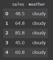
対象データは、カテゴリ変数となる weather 別のsalesを推定する問題。
カテゴリ変数により連続変数を推定する分散分析と呼ばれるモデルです。
sns.violinplot(data=sales_weather, x="weather", y="sales",bw=0.4)
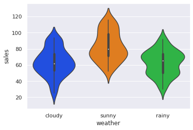
上記のとおり、sunnyのときに sales が高くなり、cloudy , rainy 間は大きな差は見られません。
これをベイズ推定でモデリングしていきます。
モデル
本紙同様、このモデルにもとづき推定します。
カテゴリ変数となる weather を、ダミー変数化するのがポイントです。
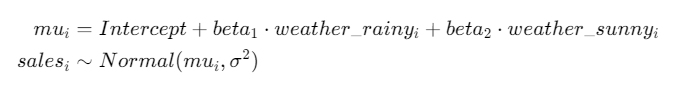
def model(
    N,
    sales,
    rainy,
    sunny
):
  Intercept = numpyro.sample("Intercept",dist.Normal(0,100))
  weather_rainy = numpyro.sample("wether_rainy",dist.Normal(0,100))
  weather_sunny = numpyro.sample("weather_sunny",dist.Normal(0,100))
  sigma = numpyro.sample("sigma",dist.HalfNormal(100))

  with numpyro.plate("N",N):
    mu = Intercept + rainy * weather_rainy + sunny * weather_sunny
    numpyro.sample("sales",dist.Normal(mu, sigma),obs = sales)

# データ
sales_weather_2 = pd.get_dummies(sales_weather).drop("weather_cloudy",axis=1)
data_dict = {
    "N":len(sales_weather_2),
    "sales":sales_weather_2["sales"].values,
    "rainy":sales_weather_2["weather_rainy"].values,
    "sunny":sales_weather_2["weather_sunny"].values
}
kernel = NUTS(model)
sample_kwargs = dict(
    sampler=kernel,
    num_warmup=2000,
    num_samples=2000,
    num_chains=4,
    chain_method="parallel"
)
mcmc = MCMC(**sample_kwargs)
mcmc.run(random.PRNGKey(0), **data_dict)
az.summary(mcmc)
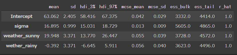
結果はこちらで、無事本紙と同様の値になりました。
モデルの確認
本紙ではbrms の marginal_effects によって各天気別の信用区間を表現していますが、
arvizには同様の機能はなさそうなので、
ここでは事後予測分布を生成し、各天気別の salesの予測区間を可視化してみます。
# 事後予測分布取得の準備
mcmc_samples=mcmc.get_samples()
predictive = numpyro.infer.Predictive(model, mcmc_samples)

# 予測用データの生成
rainy_pred = jnp.array([0,0,1])
sunny_pred = jnp.array([1,0,0])

# 事後予測分布の取得
ppc_samples = predictive(random.PRNGKey(0),N = 3,sales=None,rainy = rainy_pred,sunny = sunny_pred)
idata_ppc = az.from_numpyro(mcmc, posterior_predictive=ppc_samples)
sales_pred =  idata_ppc.posterior_predictive['sales']
事後予測分布の取得過程は前回記事と全く同一です。
では、まず各天気別の予測分布の可視化です。
az.plot_posterior(sales_pred)
少し分かりづらいですが sales : 0 がsunny、 sales : 1 がcloudy、 sales : 2 がrainy の際の事後予測分布になります。
sunny の際に sales が最も高くなりそうなことがわかりました。
なお、少々分かりづらいので別の形でも確認。
az.plot_forest(sales_pred,combined=True)
こちらのほうが、sunnyのときに sales が高くなる推定結果が明らかです。
おわりに
以上、カテゴリ変数による分散分析モデルの実装でした。
次回もこれまでとほとんど同様、正規線形モデルの実装です。